Post Time:Mar 22,2012Classify:Industry NewsView:480
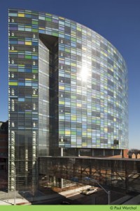
Combining both architecture and art, a new Johns Hopkins Hospital building will open next month as one of the nation’s largest hospital construction projects. The new facility, which features a colorfully constructed, artistic curtainwall façade, was a collaboration of artists, a curator, a group of architects, Bloomberg Philanthropies and Johns Hopkins. The project was led by architectural firm Perkins + Will, while architect Allen Kolkowitz provided consulting services.

Featuring the Charlotte R. Bloomberg Children’s Center, named in honor of the mother of New York City Mayor Michael R. Bloomberg—philanthropist and Hopkins alumnus—and Marjorie B. Tiven, commissioner of the New York City Commission for the United Nations, Consular Corps & Protocol, Brooklyn artist Spencer Finch was commissioned to create a colorful glass façade for the 1.5 million-square-foot building, punctuated by his hand-drawn frit pattern.
The project features aluminum panels encased in a shadowbox construction made out of two layers of glass that incorporates one of Finch’s color alphabet—a palette of 26 shades inspired by Claude Monet’s Impressionist landscape paintings. Finch used blue as the dominant color for the Bloomberg Children’s Center and green for the Sheik Zayed Tower.
“From the beginning we were thinking about glass as an analogue for water, how glass and water behave in similar ways, and what we could do with the glass so that it’s always changing,” says Finch. “Also it’s a big building and it can be intimidating, but water has a certain softness and welcoming aspect to it.”
The resulting design captures the light of the sky, allowing the building to change in sync with the environment.
Finch spent months testing and developing a broad range of colors for the building’s exterior, even observing test panels on the roof of a garage across from the Bloomberg Children’s Center site to understand how his palette would play with Baltimore’s light. He also worked closely with the architects to determine how best to create the vision. “We went back and forth a lot to really think about the connection between materials used and how the colors would be perceived since this is a work of art that will be around for a long time as part of the building,” says Eric Van Aukee of Perkins + Will, managing principal on the project. “So we put a system together with crystal clear glass that would always render Finch’s true colors and we tested it rigorously to ensure that it would stand up to the elements such as sun, high winds, condensation and rain.”
Aukee adds, “For other buildings, the art is usually done as an application to the exterior in the form of a specific work, but here, the art is very integrated into the functionality of the building. With Spencer, we were really able to transform the approach to the skin of the building—thinking of it not just as protection but also as a canvas. Together we turned [the building envelope] into a work of art.”
Finch created a frit pattern for the project. As a two-layer composition, his hand-drawn strokes are fused onto the building’s glass and steel curtainwall. The frit brushstrokes are visible from the outside but do not obstruct the view from inside.
In addition, all 26 colors of Spencer Finch’s color alphabet are on view at eye-level along the side of the building, arranged in alphabetical order.
Finch explains, “I think initially one’s first thought is that children like primary colors, that they have a very simple approach to color and I think that’s really not the case. I think kids have an incredible sophisticated color sense. I moved to a design that’s really pretty sophisticated and complex with 26 colors and colors that are subtly different and reflect the landscape, rather than being purely abstract.”
Viracon fabricated its VE13-2M and VE1-85 glass products for specifications requiring insulating, insulating-laminated and silk-screened products. Harmon Inc. was the contract glazier.
Finch says while he had the ideas for the colors, they still had to be transferred onto a façade and that is incredibly complex.
“There was a lot of work done by the architects just to get the idea up onto the building,” he says, explaining there was a lot of discussions and meetings about the materials. “We all went to the glass company together to look at the possibilities of frit. We looked at lots of different possibilities for color [and] how to apply color to glass. For me it was a real education in terms of what could be done in architectural glass solutions.”
As Michael Iati, senior director of architecture and planning, Johns Hopkins Health System, explains, “The goal is to create a humane and dignified experience for those under stress. The art created for the building and the building’s design are central to elevating the experience of coming to the hospital. Visitors and patients may not be able to quantify this directly but they will feel the building’s uniqueness and comfort.”
Noting that eeverything about this project was a collaborative undertaking, consulting architect Kolkowitz says everyone involved embraced the core values and mission of the institution.
“It was an unbelievable opportunity to embrace the context of the building and materiality of the building,” he says, pointing out that the frit was a way to help humanize the building.
“The frit grabs onto the glass and becomes an integral aspect of the overall flow and a way to blend into [the surroundings],” he says, adding that 99 percent of the building is fritted.
“The frit was not just an overall dot screen – it’s a part of the building language to invite and bring people into the architecture,” says Kolkowitz. “The frit played out to be an incredible surprise.”
Source: www.glassguides.comAuthor: shangyi
PrevGlassTileStore.com Introduces New Stock of Budget-Friendly Glass Bathroom Tiles to Homeowners
BEC Panel Addresses Contract Glazing Process from Four Different PerspectivesNext